Our $1600 Kitchen Makeover
I keep a running tally of our spending when we do makeovers. At this point we had spent approximately $1600 on our kitchen. See all of our kitchen mini-upgrades here that happened after this post.
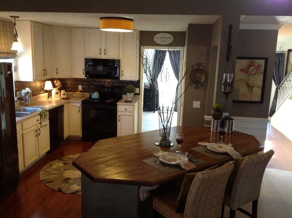
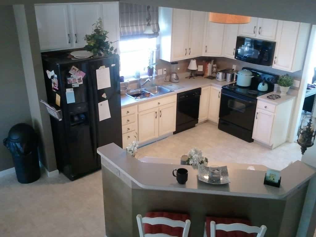
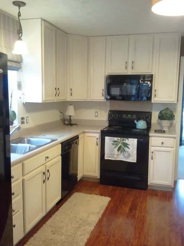
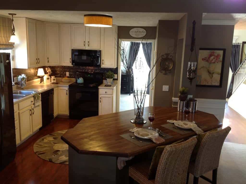
Here is what we accomplished with a $1600 investment:

One of the first DIY projects I tackled in my house was my kitchen. I built my home in 2005, but I am amazed at how quickly styles have changed since then. In such a short period of time, my house really started to look outdated! So if I were to sell my home, I knew the kitchen was going to make or break our sale price.
Back when I built, the available upgrades were slim pickins and products were way overpriced. For kitchen cabinetry options I only had standard oak (included in the base home price), or expensive upgrades like dark cherry for an additional $15-$20K. White cabinetry was still plastic-y looking and cost and additional $10K more. And I chose basic white, vinyl flooring. Wood or wood laminate was outrageously priced then too.
So our Phase I Kitchen Plan was (the links lead you to other tutorials on my blog):
…do something cool to my backsplash, change the lighting, paint my cabinets (yikes! no one was really doing that yet), and see if I could change the island or kitchen countertops somehow. And looking back, I now declare these initial projects our “Phase I” remodel (because we are always updating or adding, and we are now onto Phase II).
So here is the cost breakdown:
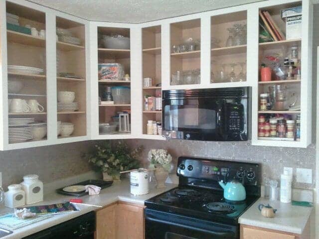
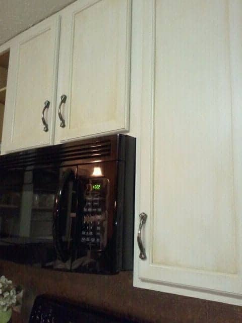
* Cabinet refacing, using Rust-o-Leum Cabinet Transformations = $149.00
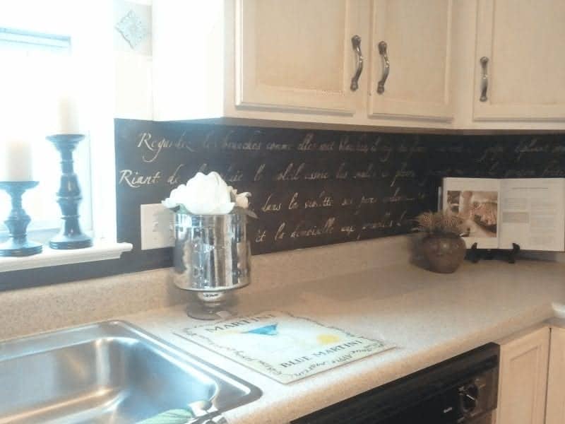
* Stenciled Backsplash, “Springtime in Paris” stencil from Royaldesignstudio.com = $100 stencil + paint supplies
* New Roman shade from SelectBlinds.com $200ish
* Drum light from Lumens.com by Elements, grasscloth $267
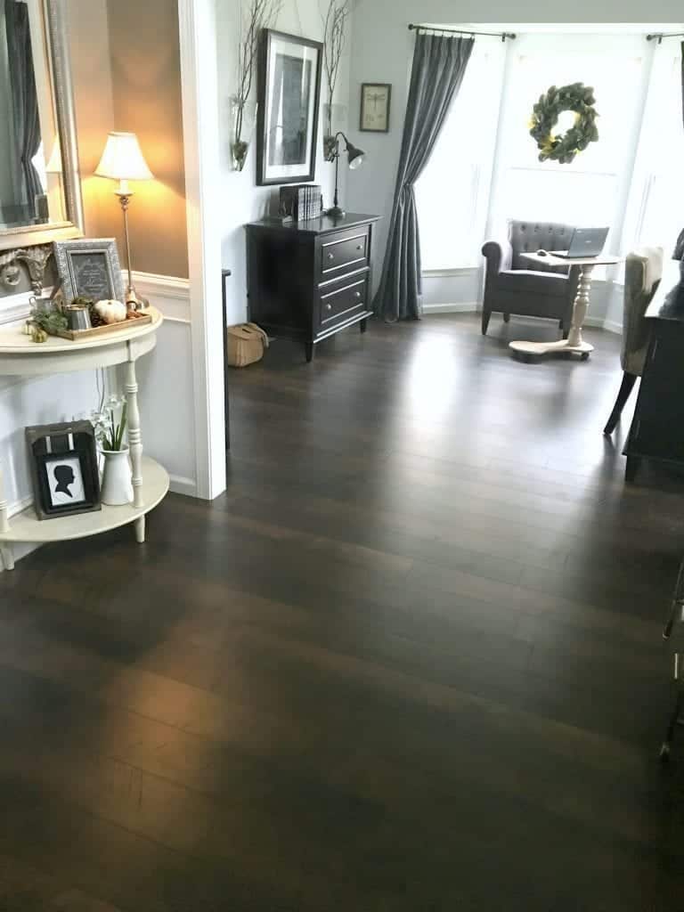
* Flooring from BestLaminate.net @ $1.99 sq. ft. (Backstory: we found an outlet store during an accidental drive-by…literally turning the car around and bought this 10 minutes before they closed…the next day…we had new flooring!)
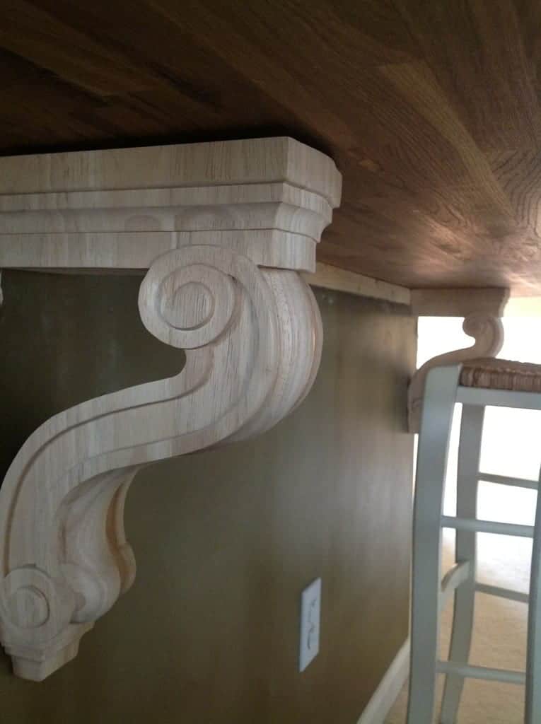
* Architectural Depot: Corbels @ $70 each.
* Ikea Numerar Oak Butcher Block @ $169 each (we bought two)
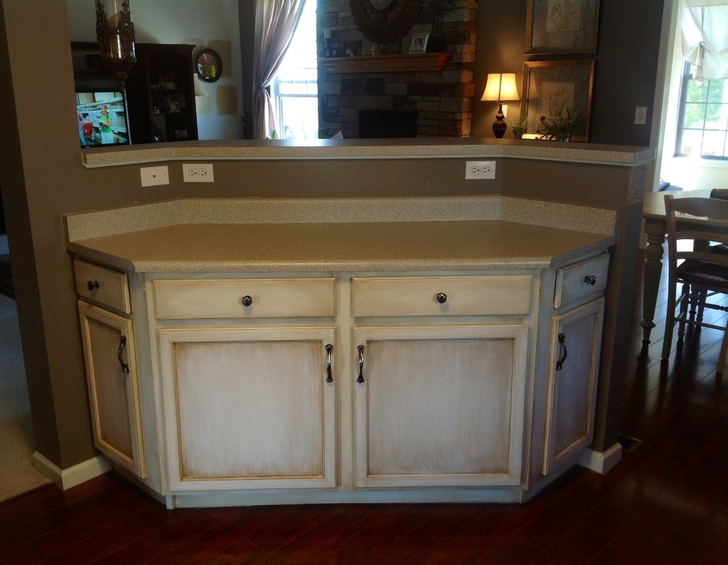
Kitchen island, before demolition:
Next…after painting we leveled the island and added two Ikea butcher blocks into one, extra wide island.
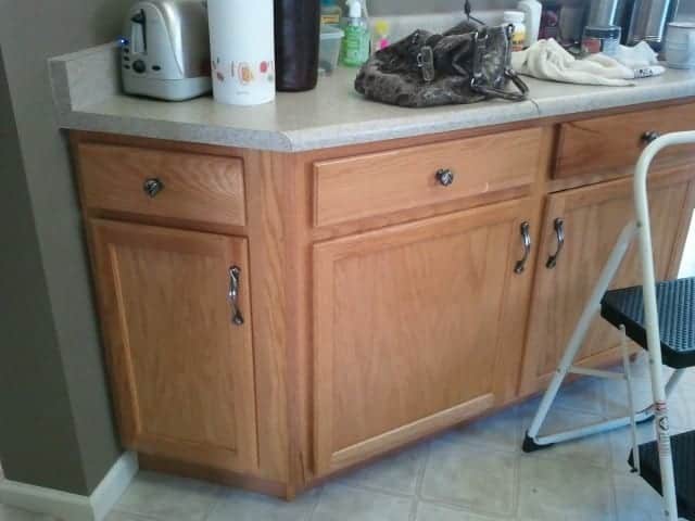
This coffee bar was too tall:
Adding corbels to kitchen island
I firmly believe that the movement of talented DIY blogger have pushed the envelope and created a huge demand for higher quality, authentic looking building materials since I built eight years ago. I also think it’s driven down the cost because bloggers find new and innovative ways to improve upon the original. So if ever there was a time to upgrade your home, it is definitely now!
For our open design home, the kitchen seemed to be the only logical place to start our transformation. Whatever we did to this room, it would “anchor” the style of the rest of the house. Plus…no matter where you sit in the house, the blaring builder’s oak was so prominent and was visible from everywhere. So I did a ton of research on what style I wanted. Then when we mustered up the courage to start this project, we funded it 100% out of pocket, one small section at a time.
I started blogging shortly after and I really didn’t know any bloggers (yet) and we were very much doing this project on our own. My ‘window to the world’ was HGTV & This Old House as well as Pinterest. If I wanted feedback on my backsplash idea, I asked Pinterest users to help me choose colors (and they did!) I even went so far as to list this project on “Rate My Space” because I wanted feedback from seasoned designers and the online communities. I was thrilled to get over 8,000 views and 44 votes rating it “Excellent”!!! Feel free to view more pictures there too! Rate My Space! So before we knew bloggers even shared similar interests as ours, this is how we would level-set our ideas with the rest of the world. This was especially helpful if we chose to sell the house (something that is still under discussion).
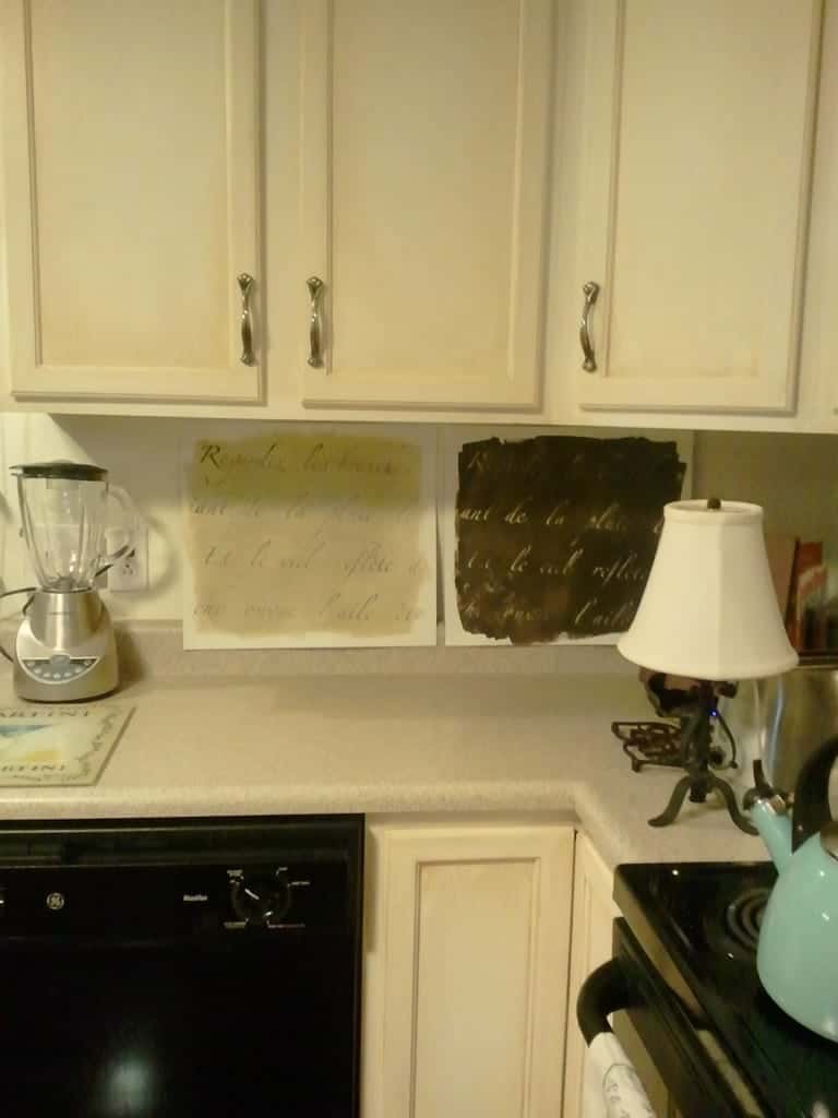
Below, I’m carefully choosing which palette I wanted before I committed. I’m a little picky like that:
Final backsplash result…thanks to Pinterest, everyone weighed in on which color looked best.
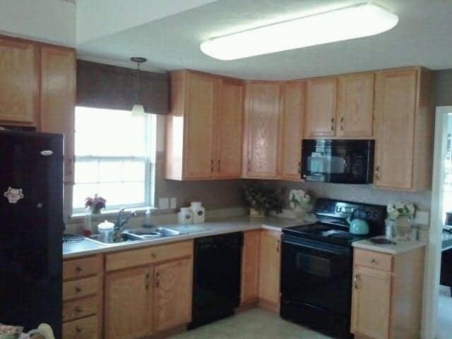
So many smaller projects make up this total kitchen transformation including a Rustoleum Cabinet Transformation paint project, new lighting, new Roman shade, new butcher block island, stenciled backsplash, new floor) so sometimes it’s nice to take a gigantic step backwards and marvel at what it once was. Over time we plan to tweak the decor, but it’s come a long way from it’s prior state (a plain ol’ builder’s grade, orangey-oakey, nuthin’ special space)…to the true heart of our home.
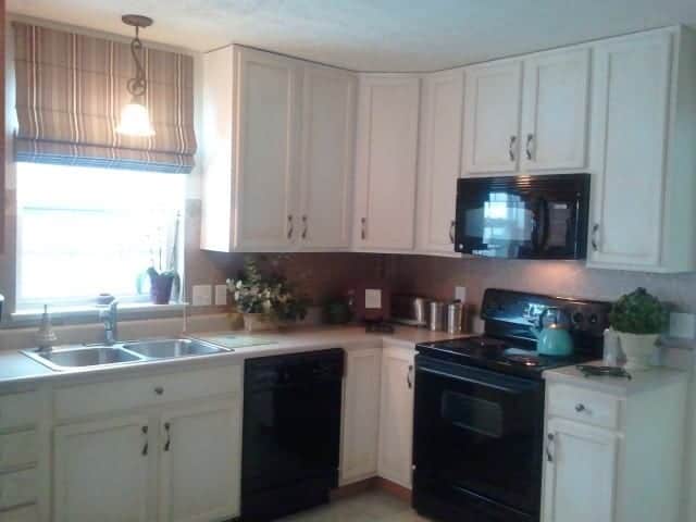
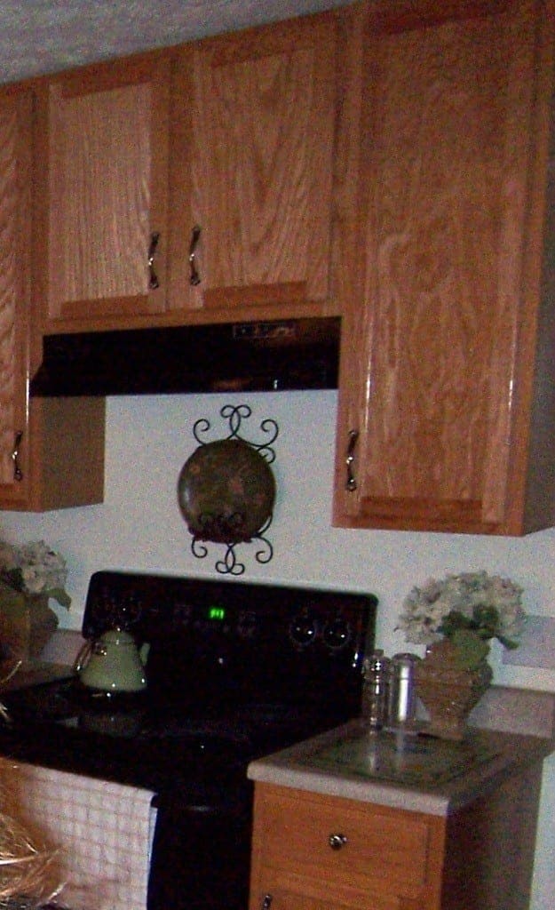 (Above: A grainy picture taken in 2006 of the cabinets after I applied poly…no backsplash, and no microwave above the stove :))
I make no bones about this–sometimes you need to step away from the paintbrush (or any DIY project) just to clear your head. So here are some pictures when we did just that. I took a few pictures, then went back to Pinterest for more inspiration. I assessed the situation, asked some Pinterest folks…and arrived at the conclusion that a dark backsplash and new flooring was in my kitchen’s future:
So…here comes the flooring…
Super-white kitchen. I lived with it like this for awhile trying to decide whether the flooring was really needed. Yes, it was :)
Full kitchen $1600 upgrade:
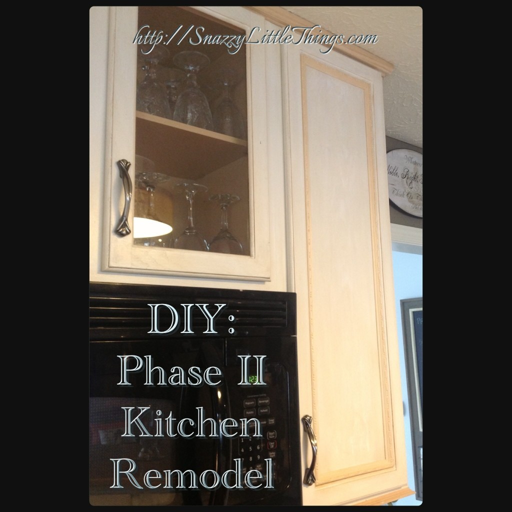
Thanks for following along! Be sure to check in on my Phase II kitchen project!



Hi Jeanette,
! I like the interior design that you have shown of yours kitchen also I have rated it on HGTV
Thanks Clarissa! It was done on an extreme budget, so it’s good to get feedback. My preference would have been to get new cabinets and real wood floors (not laminate) but we could only afford so much. Thanks again!
Love your beautiful home!
Sheri,
Thank you for your comments :) …I we have worked hard in 2012 and learned a LOT! Just took a breather in January. Now it’s time to start renovating our old furniture…lot of those posts to come.
Oh, goodness! What a change! I know you are so proud of it – I am IN LOVE with that island. I don’t have room for one in my kitchen, and I’m quite jealous.
Following along in my reader now!
Thanks Lindsay…and it’s STILL not finished but we posted it anyway. I am thinking of putting a distressed / driftwood grey beadboard on the facing of the island now, open shelving and crown on top of the cupboards. So many little things unfinished around here!! I went through your site the other day and love the “finishing school” connotations. My head is full of ideas on how to change my site now too. Blog renovations are my biggest DIY challenge.