Design Tips: Make a Retail Pop Up Shop
In October we set up a pop-up retail shop for the very first time, and let me tell you — it was so much work, but SO much fun! We had never tried participating in a retail event before, and because these were juried shows (your store goes through a vetting process) I wasn’t too confident my booth would be accepted. But after only one day of waiting — we were approved! So now it was time to actually build the booth. Creating this space felt so much like a room remodel (as you know, we’re “sort of” familiar with that process). So in this post I’ll share how we rocked our very first juried show and the materials we used to pull it off.
Update: We have since retired from these shows, but have a local antique booth and we are loving it! Click here for more of my antique booth ideas.
Our booth mock up:
When I applied to the juried shows, all we had was this booth concept.
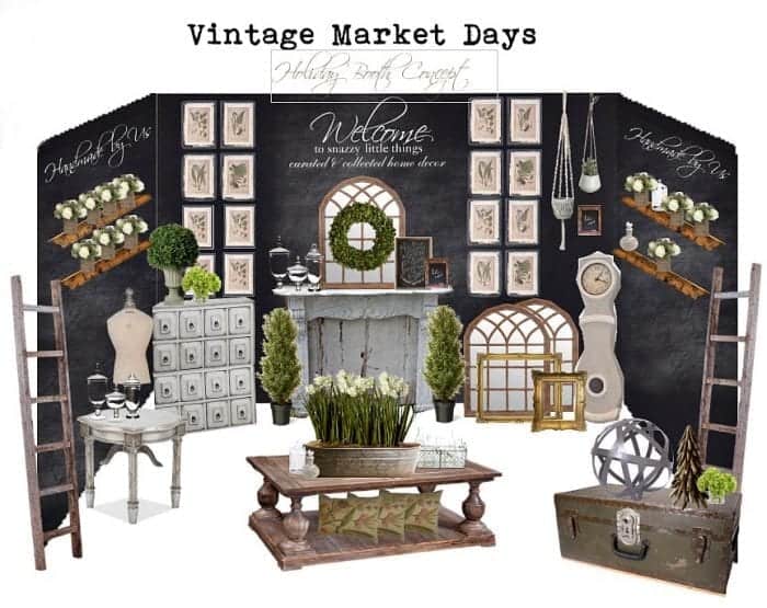
This is all we could offer since we had never set up anywhere else before. We wanted our booth design to feel like customers were walking inside of our home. Now the pressure was on to make this concept a reality!
On a side note: Mark has a knack for pulling together all of my crazy ideas and making it look cohesive and on purpose. Thank goodness he gets me. Most men would run away screaming (wait…that’s happened before). He would work his magic to make this space a reality (all after working his real job during the day).
Sourcing Materials for Our Booth Design:
Here are some products I found, mostly on Amazon because I couldn’t waste precious time driving around town looking for items.
Version 1, Booth Design:
Vintage Market Days Columbus 2017, the event theme “Gather”
For our very first show, we came pretty close to our design concept. I didn’t have a lot of greenery and no rug (dirt floors would have destroyed it). But this was an amazing show, and we had so much fun! The black walls were a big hit. We tried a couple of different configurations (removed the center wall and moved it to the side). But overall this looked really great.
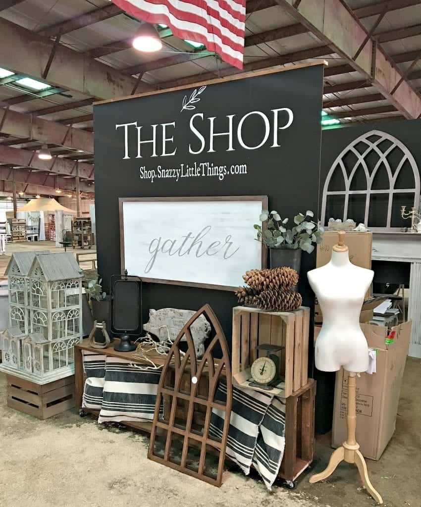
My love for high-contrast interiors took over, so the booth design reflected that. Once I created the booth mock-up drawing, Mark had creative license to create the structure. He did such a nice job, don’t you think?
Here we are still setting up and figuring things out.
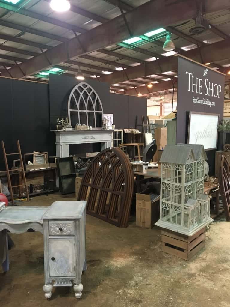
Adding rugs, plants, mini lights and all kinds of fun embellishments I knew would really round out the design, but we were running out of time. My botanical art on the back walls really looked great.
Version 2:
Vintage Market Days Cleveland Theme “joy”
Two weeks later, I had ordered linens, greenery, lighting and candles. We brought the rug from my craft room. We had more “smalls” — inexpensive items for customers to purchase. We did a much better job with signage and priced almost all of our items. We made the decision to add more point of sale devices to eliminate long lines and improve customer service.
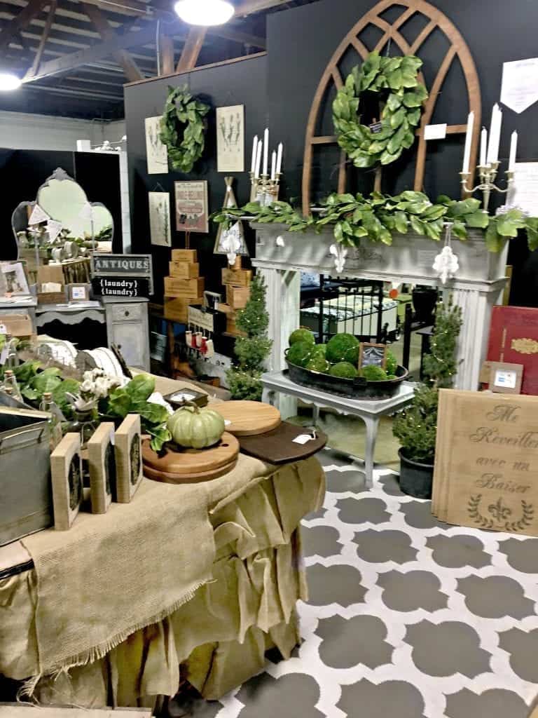
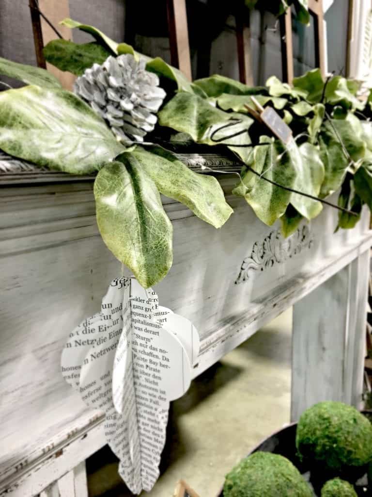
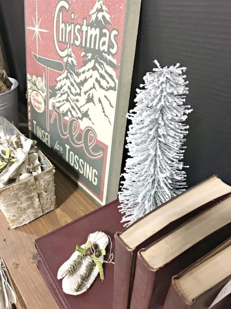
Hover the image above to see where I purchased specific items. And no, I didn’t purchase my daughter for $19.99 but she was freezing and didn’t put on her apron yet, lol!
Our dog bed table where my daughter is seated also served as our desk for checkout. Angling the desk outwards helped the checkout process run more smoothly and reduced backlog inside of our booth.
Advice & random thoughts:
- Tell your story about why you create
- Tell it in 30 seconds or less :)
- Funny is good. Mark pulls off some funny comments when people stop in.
- Brand yourself (black aprons really helped people know who was working our booth)
- Greenery, rugs and lighting really make your booth look amazing. Even if you just have mini lights, it’s a start!
- Don’t be afraid to make your booth look different than everyone else.
- Clutter can be overwhelming
- Customers complimented our uncluttered, clean look making it easier for them to shop and make decisions
- Sell furniture faster by placing nothing on it and pulling it towards the front of the booth
- Create an incentive for customers to sign up for your store newsletters (I gave away the large farmhouse sign on display)
- Mailchimp has an app on iPad that makes it super simple to collect email addresses – no wifi required!
- Signage included types of payments accepted. A menu of custom work that we do. I decoupaged a photo of my Better Homes & Gardens experience and many people remembered that article!
- Rent a UHaul trailer for only $39.99 a day. We figured this out finally during show #2. Since we live in a neighborhood with not a lot of yard space, this is much more economical than buying a trailer and renting a storage unit.
- We used newspaper and black tissue paper to wrap breakables in, and had 3 sizes of bags for small, medium and larger items.
For now I just wanted to marvel at the fact that we pulled it off! Expect updates on Instagram LIVE and on my story where I’ll provide more behind the scenes.
Follow our events calendar:
#shopsnazzylittlethings


This post is so inspirational to me as I just starting doing shows. Booth layout and design has been something I’m still working on and developing. Thank you for sharing your creativity!