The Family Room
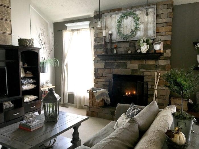
Sharing a few photos of our open concept family room, including photos of how it’s looked throughout the years (and through the holidays).
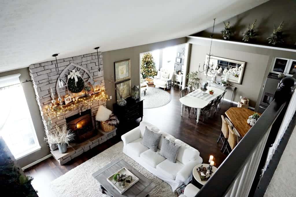
Previous photo were taking with a broken iPhone. Sorry for the blurry photos. We upgraded our camera over the years.
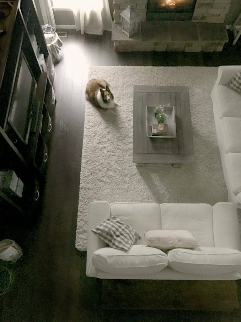
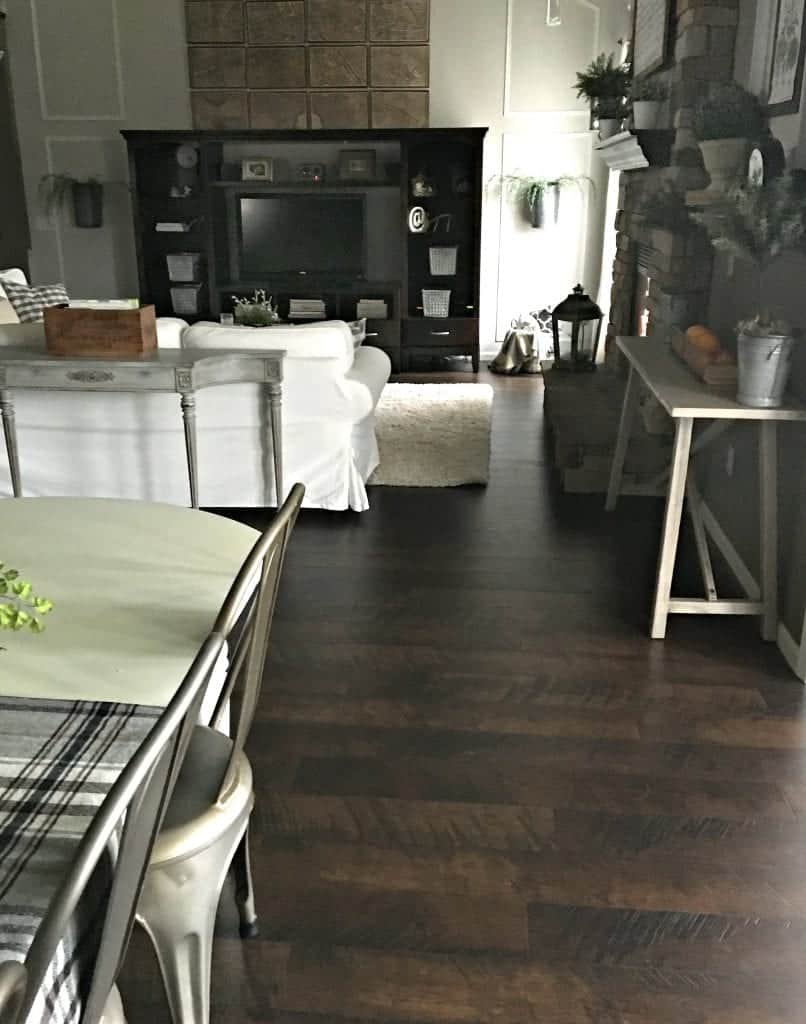
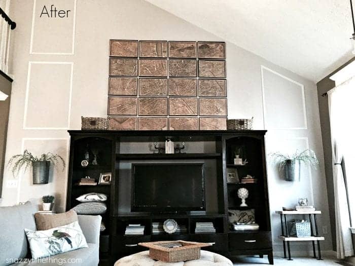
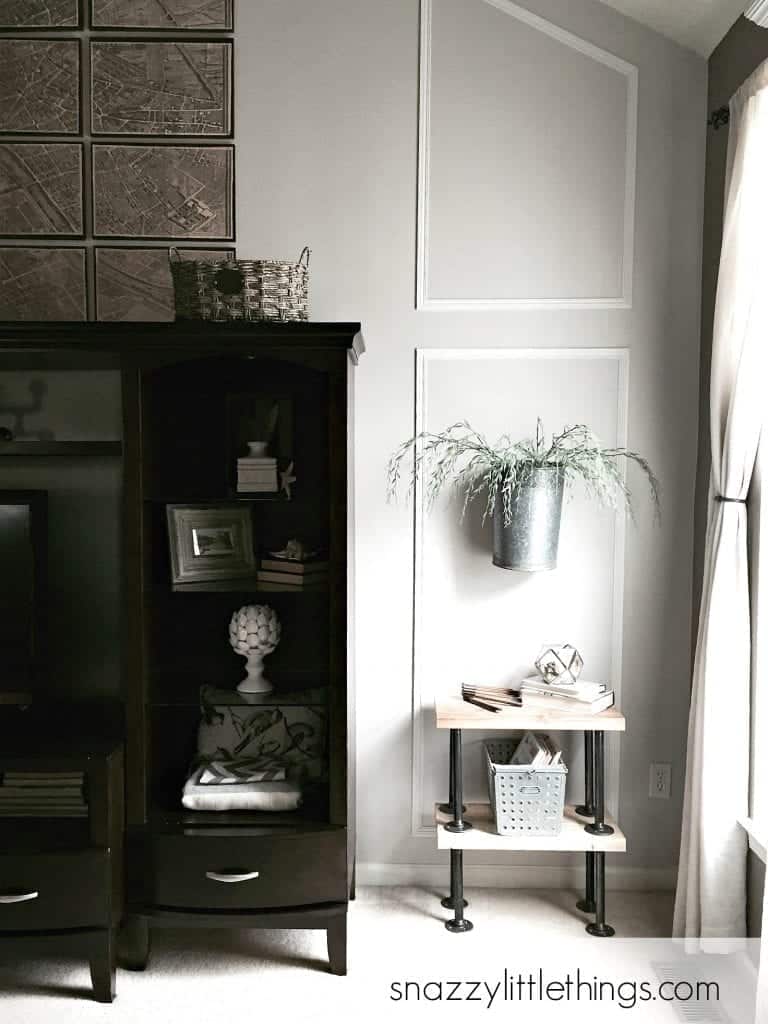
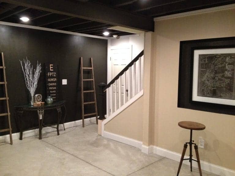
In April 2015, we updated the walls with new paint and trim.
Here is the wall, before the new paint and trim.
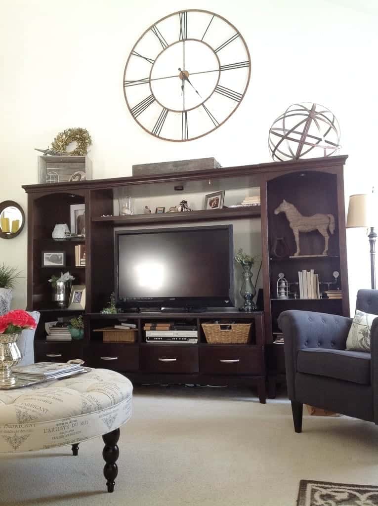
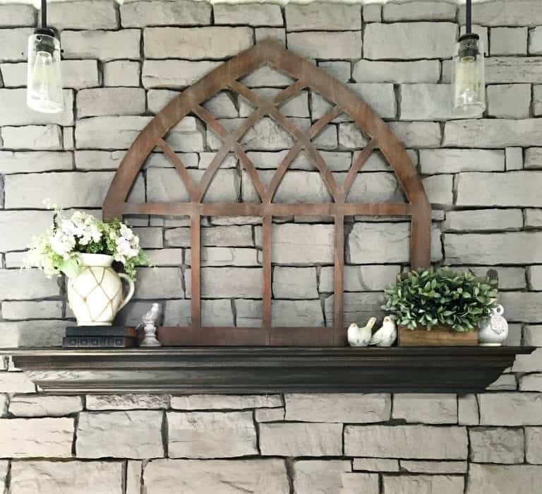
Having an open floor plan has it’s fair share of design challenges. The size and scale of my wall decor had to adjust after living in a 900 square foot ranch. So when I moved in, many items I brought from my tiny house were dwarfed on my two-story walls. So I started from scratch with my home decor, and had to learn how to decorate with some continuity between rooms so they would flow. That’s why I made my own Restoration Hardware “knock off” wall art.
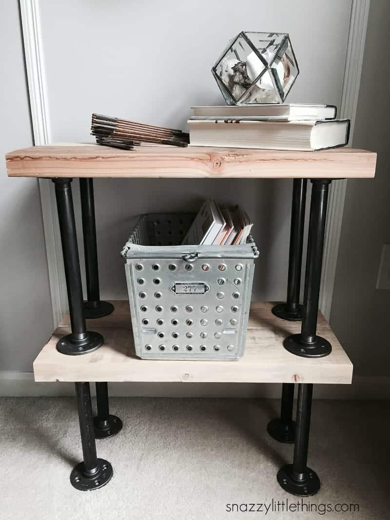
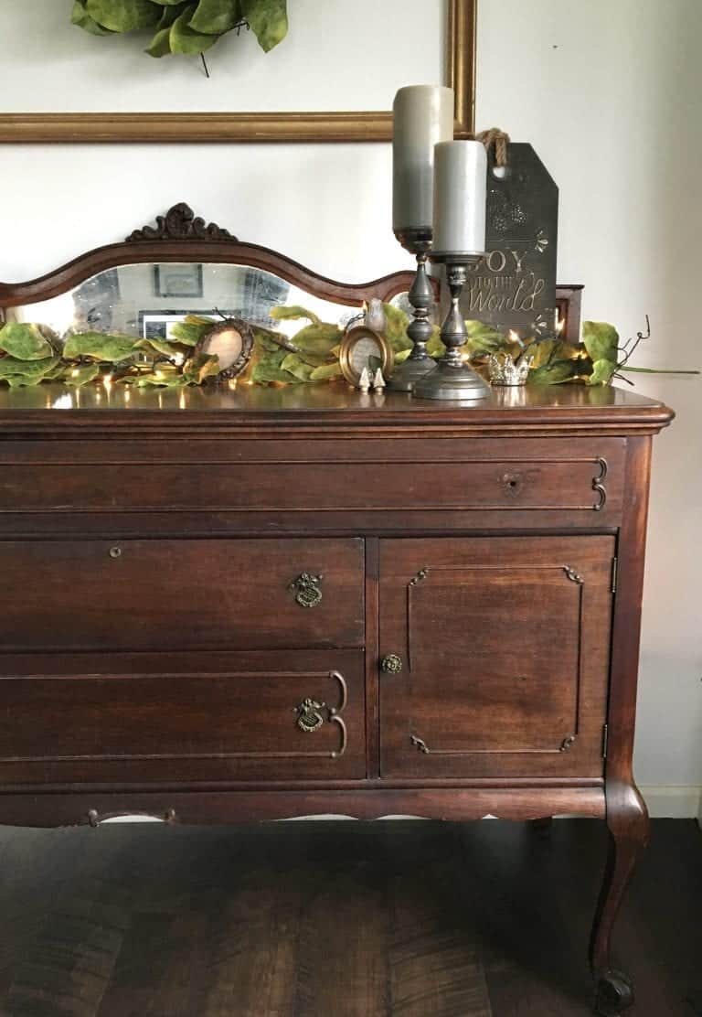
I try to add industrial touches as I find them. We created these tables in April 2015.
Fall, 2015:
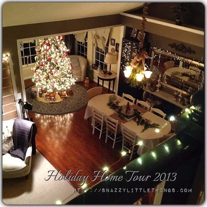
A view from the balcony during Christmas 2013, before we replaced the floor with all Pergo.
A look back to 2012: a glimpse of our old laminate floors and I REALLY want to rip out the carpet and extend wood laminate throughout the entire house, which we finally did!
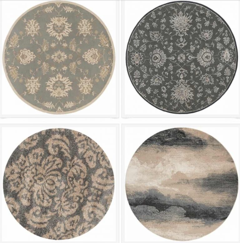
Sources (scroll through to see where I purchased the decor for the family room)


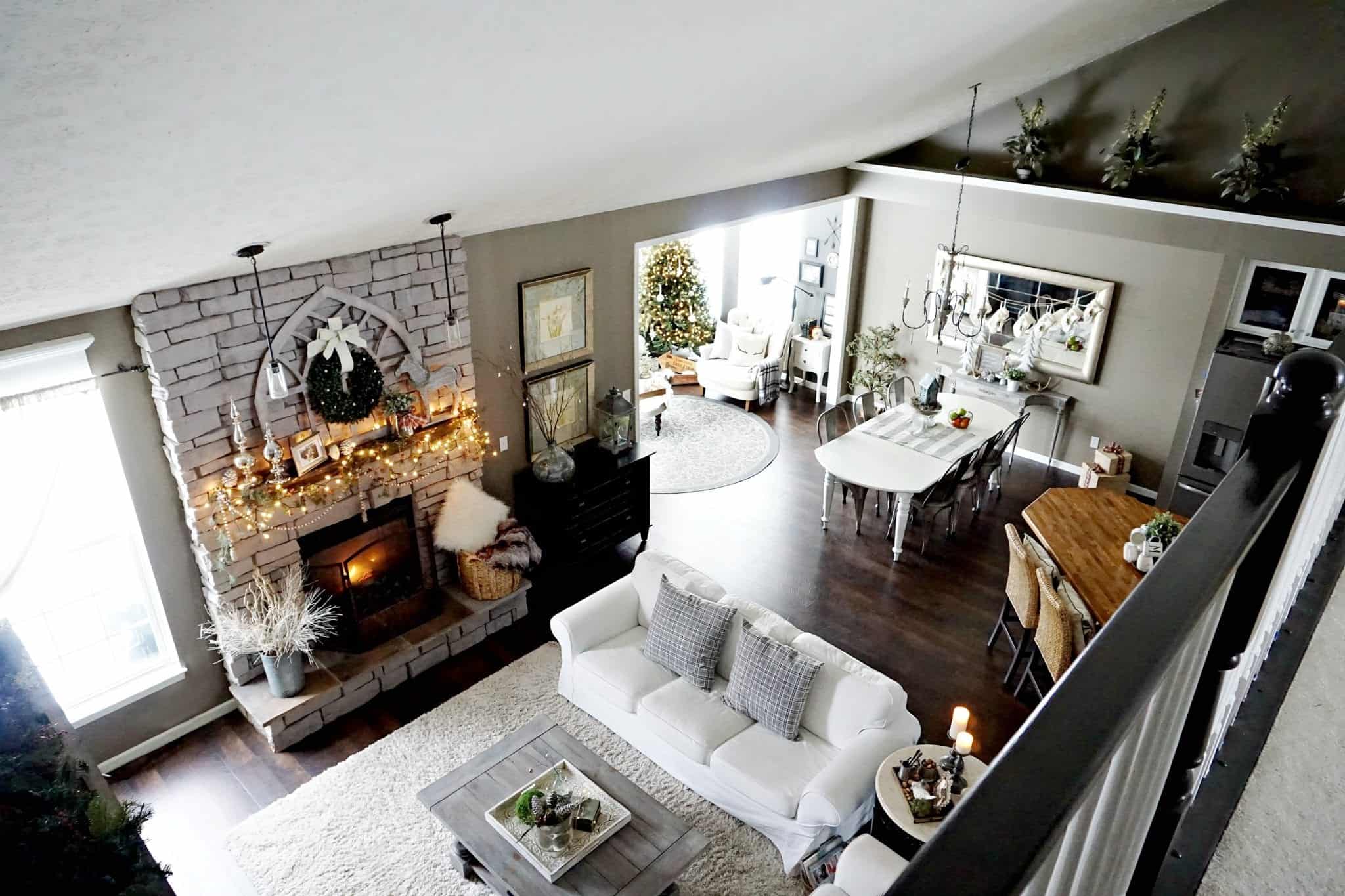


Love, love, LOVE your style. Particularly would love Information on the style/ brand your white couch and love seat in your family room. I really need to replace my family room couch. But I love so much that I would have to list way more than there is room for.
Thanks so much, Kate. Our style used to be all over the place, but we evolved into a really simple style that’s easy to maintain. The couches are from Ikea, the brand is Ektorp with the white slipcovers. We love them!