A pretty new rug in the sunroom

A well-chosen rug can make a room look amazing. Thanks to Mohawk our new rug made all the difference in our sunroom and cozied up our space. Also visit –> Erin Spain || Home Beautifully || The Striped House || Take Time for Style to see their pretty new rugs, too!
The Changes I Made to the Room
Disclosure: This post is sponsored by Mohawk Home. All opinions are my own.
Our sunroom has gone through about 85 iterations of my own trial-and-error style of decorating. About two years ago our sunroom evolved into more a rustic bohemian style look and at that time I absolutely loved it. But over time we seemed to be using this space less and less. Every room in my home can use small tweaks now and again to make it look and feel just right. Here are the edits I made to address the flow and function and make it more comfortable for all of us. After two years I’d say this room was due for an update, don’t you?
1. A Perfectly Sized Cozy Rug
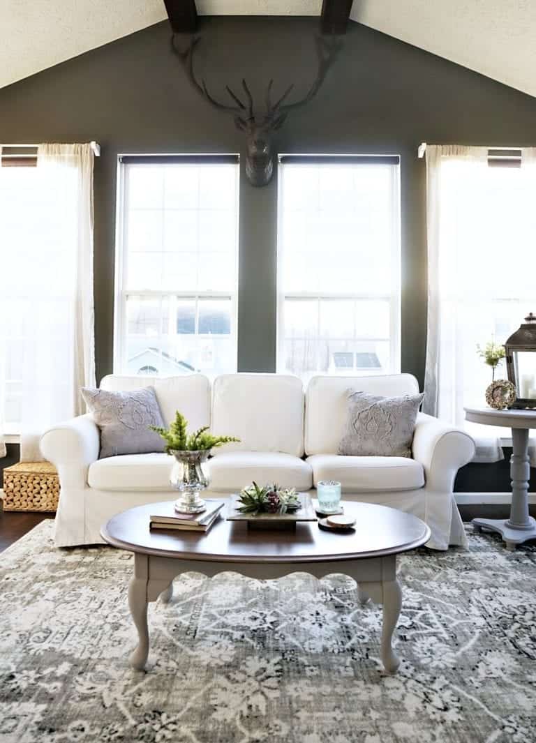
My rug is from the new Mohawk Prismatic Collection in “Stamford Distressed Floral”. Can you believe the fibers are shimmery because they are made from recycled plastic bottles? But it’s so plush underfoot.
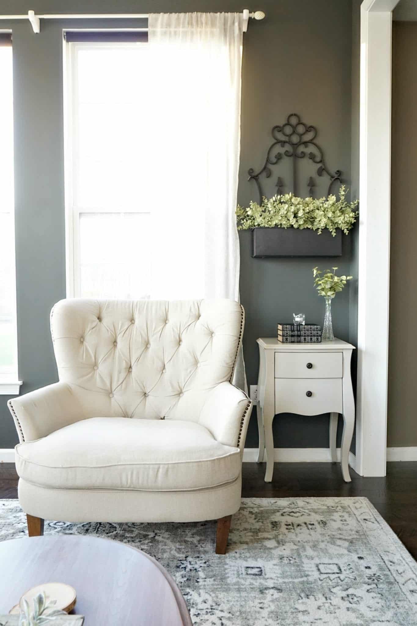
This room was transformed once we upgraded to an 8′ x 10″ plush, rectangular rug (versus a 9′ round indoor-outdoor rug). It feels like we gained livable space, it makes the room more inviting and offers a place where the kids could sprawl out and do homework.
2. The sunroom now passes “the coffee cup” test
If you ever want to test a room for usability — sit down with a coffee cup (or a drink) in hand. Do you have a comfortable and immediate place to set your coffee?
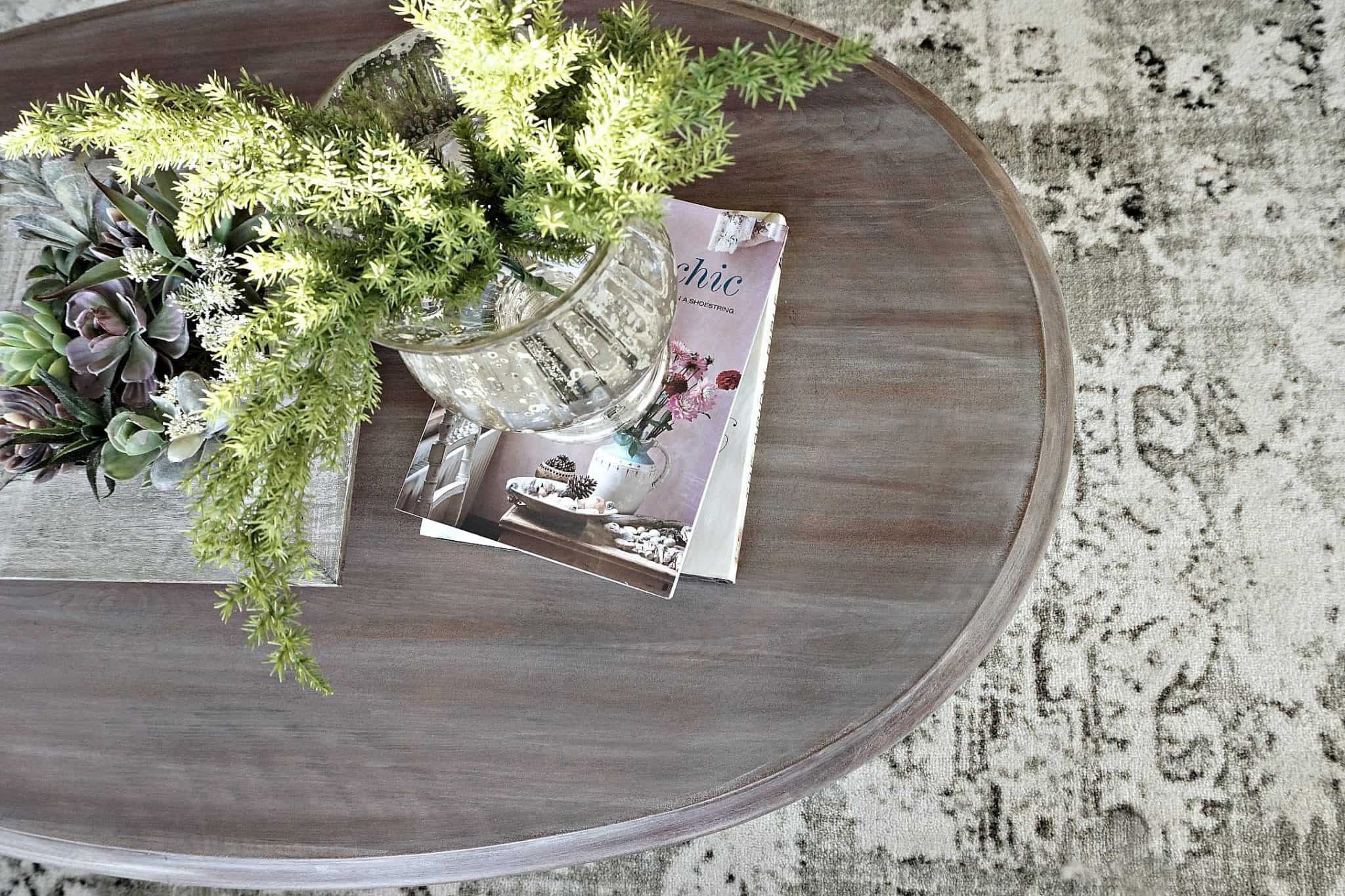
Before, our sunroom failed my coffee cup test at every angle. So it was time to replace the tufted ottoman. I’ve had this $5 thrifted coffee table that needed some serious work. Changing out the coffee table immediately improved this room’s ease of use. While I love the pretty pictures the tufted ottoman offered, I love our new table even more. It now feels like the perfect height, shape and size for this space.
3. Less Furniture
I had to empty the room to roll out the rug. It was honestly refreshing seeing it empty for a change, so very few items were added back. I reduced the clutter (furniture included). And you may have noticed fewer pillows. I like simple (as you know) so I carefully selected some new, pretty textured pillows for this room. I’m still on the lookout for some lavender pillows to add soon.
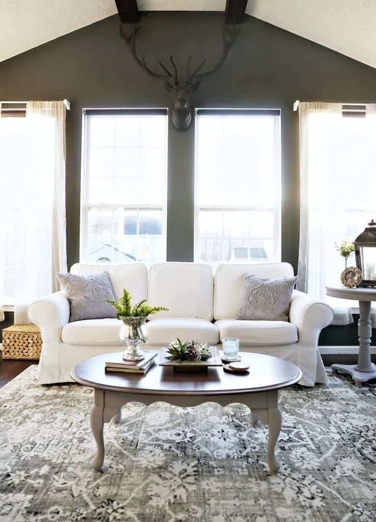
I even painted an old side table we had in the basement a pretty grey. I also removed a floor lamp that overpowered the room – by doing so it opened up the space nicely.
4. Adding Plants (Faux or Real)
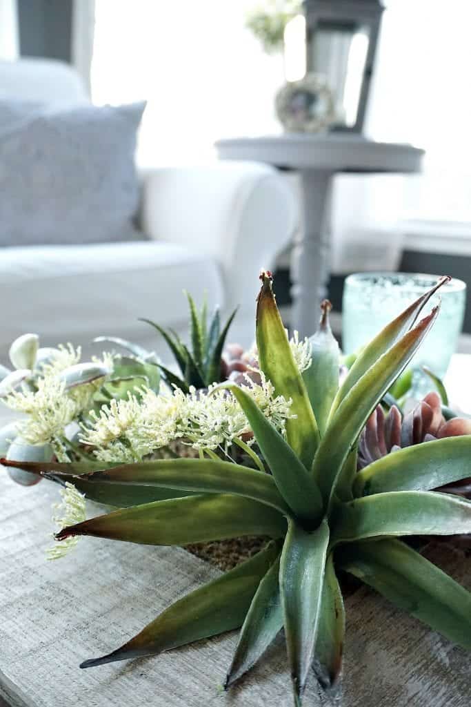
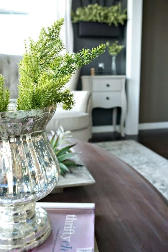
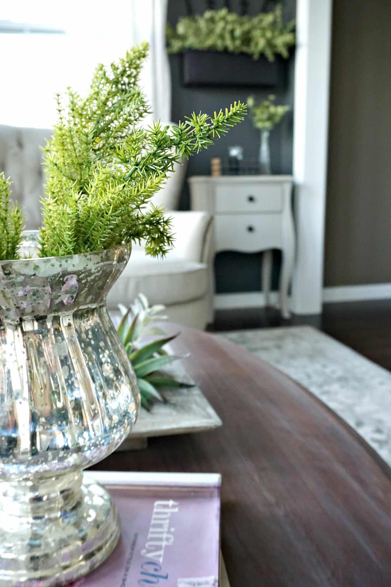
Spring means fresh flowers and plants. Lemony greens work well in this room. I also love the flecks of lavender in our new rug, so I picked up a few plants that complemented those colors. In fact you may start seeing more lavender in this room — all thanks to our new rug.
5. Contrast
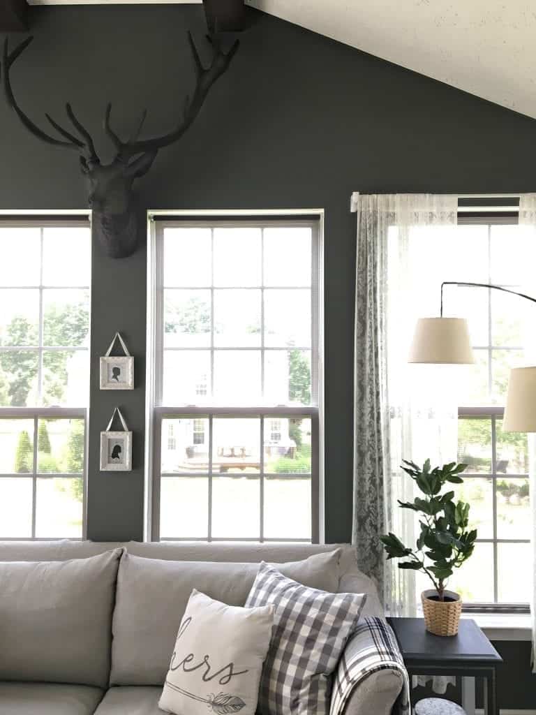
Today my photos reflect exactly how we experience this room. Normally I photograph this room at odd hours to avoid the bright sun. But the fact is, this room is always sun-filled and has an orange glow. The warm afternoon sunlight made choosing paint difficult. So after a few years of grappling with paint colors, I chose darker wall paint that neutralized the sun’s orange glow, and lighter furniture that didn’t fade. I love high contrast decorating, and I nearly painted my rooms all white, but stuck with my darker walls and floor. I like how it adds drama to the space.
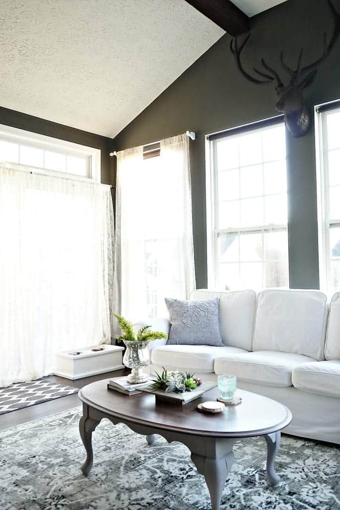
I’ve had my sunroom on my “mini remodel” radar for awhile now. Who knew a rug is all this space needed? Once I cleared out the space (we removed the light, side tables and updated the rug) I had a brand new, welcoming palette to work with, and I love it!
Next, Visit My Blog Friends’ Homes
It was tough making a decision which rug to choose. I have several favorites which you’ll see in today’s home tour. Be sure to visit all of the bloggers who also transformed their rooms thanks to Mohawk Home and their gorgeous new rug collections!
Erin Spain || Home Beautifully || The Striped House || Take Time for Style






Oh my gosh, how serene and lovely! It feels so comfy and relaxing. I love it!
Thanks so much! Maybe that’s why my family is always so sleepy when they’re here. :) It was fun touring with you!
It is a beautiful rug! I like the lightness of it and yet it ties everything together. Great choice!
Thanks, I also loved a very modern abstract rug which would have been awesome, too, but I went the more traditional route. Thanks for stopping by to comment!
Your coffee cup test is so great. I often look at pictures of beautiful rooms and realize they have no place to set a drink or a book and no light to read by near a chair or coach. We want our rooms to be usable as well as stylish. Thankyou.
I’m getting more practical with my decorating the older I get. Styling for photos is also fun – but will be fully disclosed in future posts :)
Such a gorgeous space! That rug is the perfect neutral and plays so well with the room!
Thanks so much Kristin! Love your new space too!
Is the floor real wood or something else? I would love a floor that color.